Foto: Unsplash
Stylised pathways to “well below 2°C”
COMMENTARY: Some people love negative emissions, others hate them. Some people think 1.5°C is impossible, others think it is a matter of political will. I think stylised figures are a great way to explain the challenges.
Every now and then a tweet grabs people’s attention, and it gets lots of retweets and likes. I had one recently, not viral, but let’s say “popular”.
Popular is a funny thing, as I have tweeted this figure before and it was not so popular.
I think these tweets are popular as they strip out the details and focus on only a few (simple) mechanisms. What does this figure show?
-
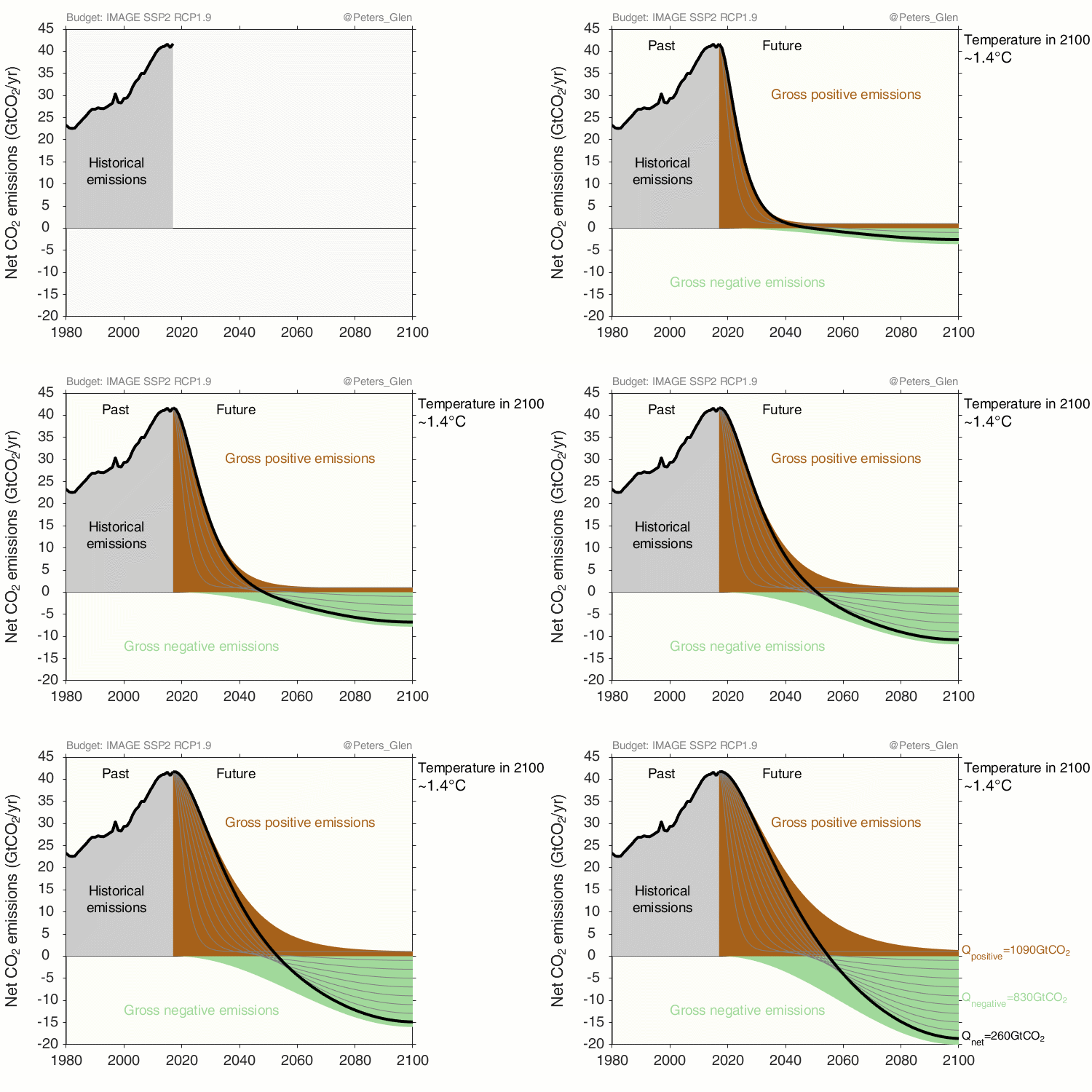
Without any negative emissions (carbon dioxide removal), 1.5°C requires zero emissions in 10-20 years;
-
Negative emissions allow slightly slower short-term mitigation, if it is offset by negative emissions later in the century;
-
The slower the short-term mitigation, the greater the negative emissions;
-
Negative emissions need to start today to get to the necessary scale, one of my hobby horses;
-
The year of net-zero emissions is around 2050, regardless of the amount of negative emissions.
While all these points are essentially known to science via previous emission scenario exercises (e.g., IPCC AR5 Chapter 6), they are not generally well-known outside of the scenario community. Stylised pathways do an effective job at communicating the key mechanisms, I believe.
Based on these stylised pathways, I also get a variety of follow up requests: 1) animations for 1.5°C, 2°C, and 2.5°C; 2) delay before mitigation starts, another popular tweet; and 3) delay in negative emissions starting. In this blog post, I am going to focus on different temperature levels, point 1.
Negative emissions for different temperature levels
The following figures are based on cumulative emission data from the IMAGE integrated assessment model. Though, all integrated assessment models show pretty much the same thing. From IMAGE, all I take is the cumulative positive, cumulative negative, and cumulative net (positive plus negative) emissions from 2017 to 2100. The various cumulative positive and negative emissions are then distributed over time using stylised functions (see methods below). These pathways all have the same net cumulative emissions in 2100, and therefore should have about the same temperature response. The approach is motivated by an earlier paper, that we have been looking at generalising to negative emissions.
Approximate pathways to ~1.4°C in 2100
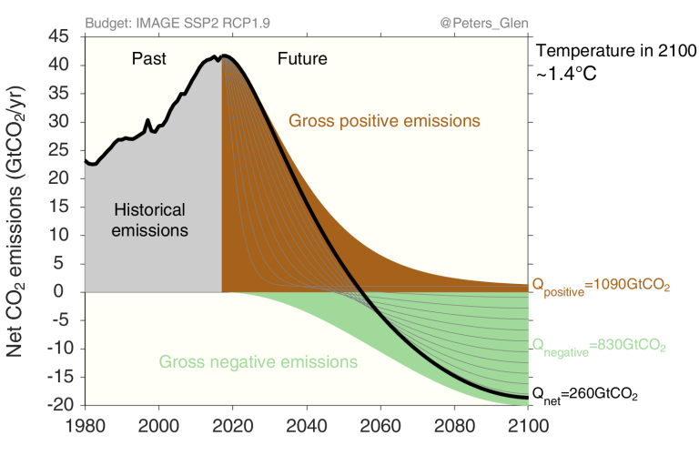
The following animation is for a “below 1.5°C” pathway, or radiative forcing of 1.9W/m2 in 2100. This scenario has more cumulative negative emissions than the original tweet, as I have linked more closely to actual scenario data.
Approximate pathways to ~1.7°C in 2100
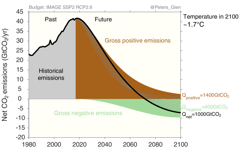
The “well below 2°C” pathway has a radiative forcing of 2.6W/m2 in 2100, and actually has a median temperature of about 1.7°C in 2100 (reference, data). One can debate if this is “well below 2°C”, but I am happy to argue it is.
To go from 1.4°C to 1.7°C substantially increases the carbon budget and decreases the need for negative emissions. It appears as though there is little variation in short-term pathway, but the percentage reduction in 2040 varies from 40% to 60% of 2017 levels. Relatively small in some senses, but quite some effort!

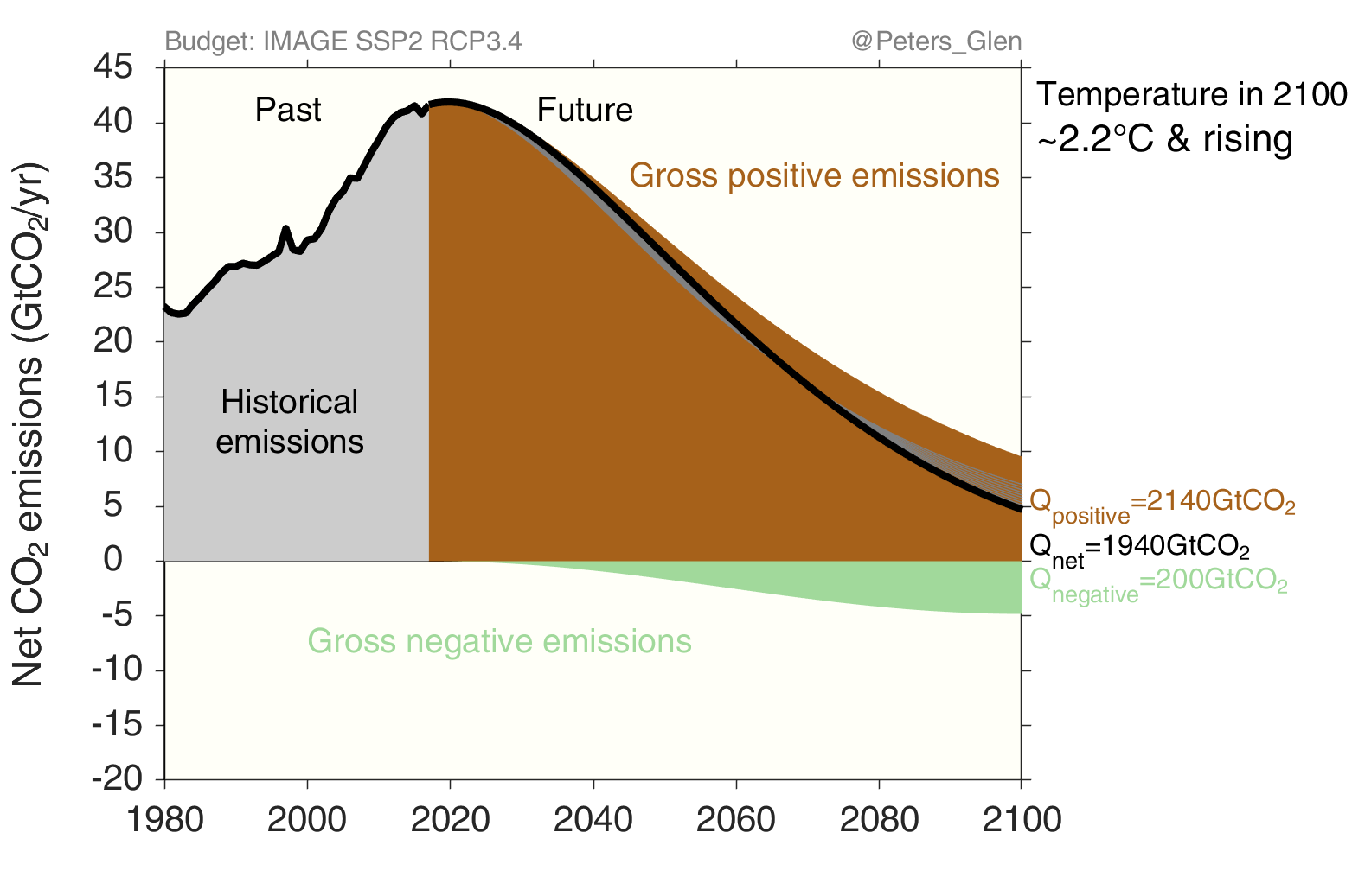
And, here are all the figures together for 1.4°C, 1.7°C, and 2.2°C to allow an easier comparison of the differences. (Download GIF here)
Method (only read if you are into details)
The challenge is how to distribute a cumulative emissions budget over time, when net-negative emissions are allowed. This is to extend a weakness of an earlier study, that did not allow net negative emissions (though, did allow gross negative emissions that were less than gross positive emissions).
The general approach is to work independently with the gross positive and gross negative emissions. By definition, cumulative gross emissions, whether positive or negative, can only grow over time: they are monotonically increasing (or decreasing). The global burden can then be distributed for the gross positive and gross negative emissions, and the sum of the two leads to net emissions, which may be either positive or negative at different points in time.
The distribution of the allocated budgets over time requires the development of stylised functions of gross positive and negative emissions.
For gross positive emissions, we follow our earlier work distributing positive emissions, but it is extended to allow ‘residual’ positive emissions in 2100. These are emissions that cannot, except at presumed prohibitive cost (in whatever way cost might be measured), be reduced to zero, for example certain industrial or transport emissions (residual emissions or difficult-to-eliminate emissions).
For the pathway of gross negative emissions, we use a scaled cosine function, growing from zero following an S-shape typical in technology deployment, reaching a steady state in 2100, indicating some form of technological maturity or saturation plateau.
The functional forms that we have used are stylised. Real pathways will certainly not be so smooth or monotonic, but stylised functions are nonetheless simple and therefore useful. It is straightforward to test the sensitivity of the analysis to different functional forms and different parameters (e.g., residual emissions) or to. The purpose of this analysis is to demonstrate and explore a framework, and stylised functions give more flexibility.
The following figure demonstrates the global pathways with the same cumulative gross positive and negative emissions to 2100 as the actual IMAGE scenario but using the stylized functions. The pathways for gross positive emissions are very similar, indicating that the IMAGE model’s mitigation pathway for this scenario leads to a pathway close to an exponential decline with residual emissions, the basis of our method.
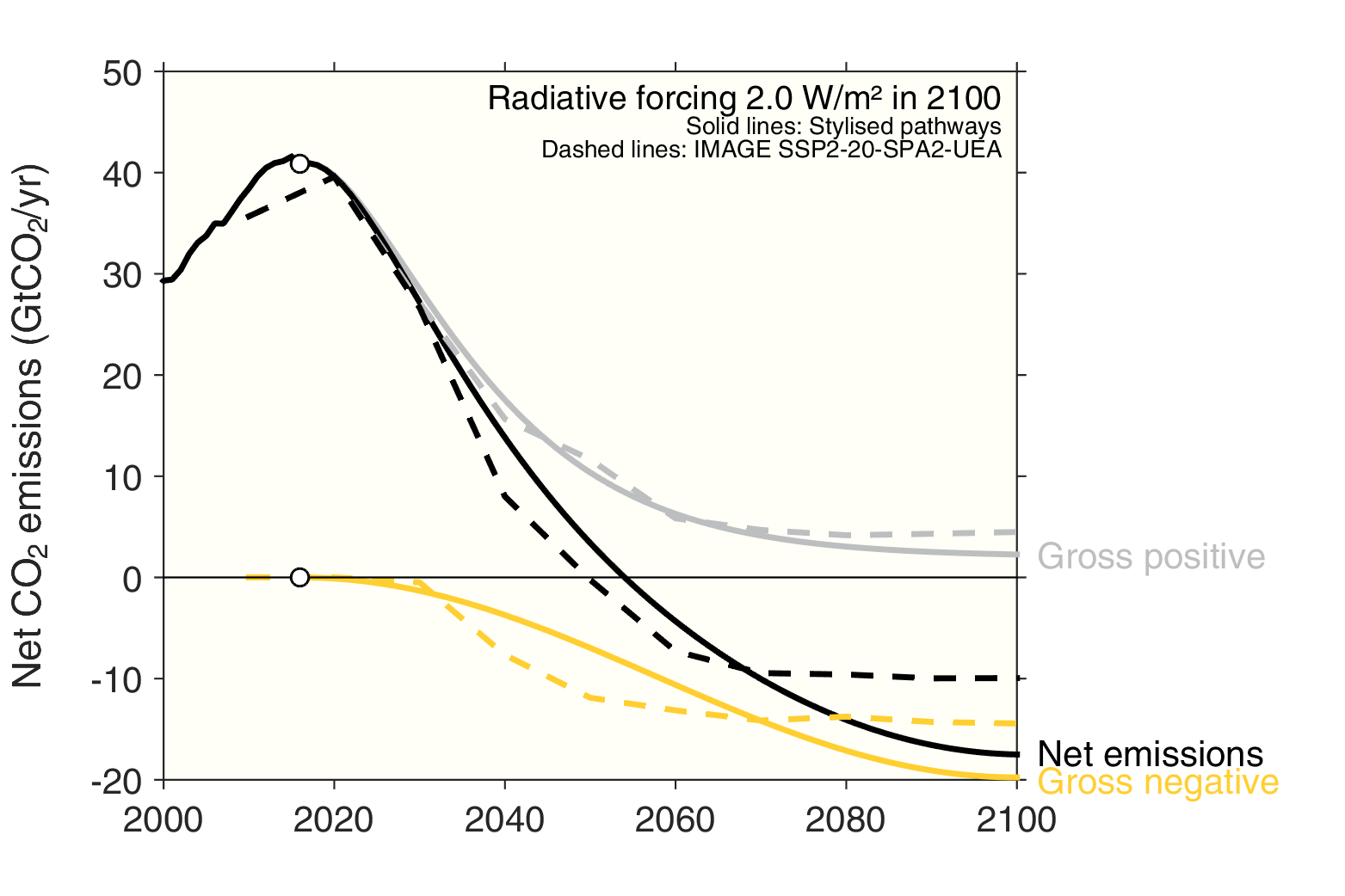
The pathways for gross negative emissions differ somewhat, with IMAGE in this scenario allowing much more rapid deployment of BECCS, reaching almost full deployment in only 20 years (from 2030 to 2050). This rapid deployment means that more CO2 is removed from the atmosphere in the first half of the century, relative to our pathway, such that less is required in the latter half.
The results for the MESSAGE model, based on Rockström et al (2017), are remarkably similar. It would be hard pressed to convince anyone we have not done a curve fit here, but we haven’t. All we do is take the cumulative budgets from the integrated assessment model, and distribute over time with stylised functions!
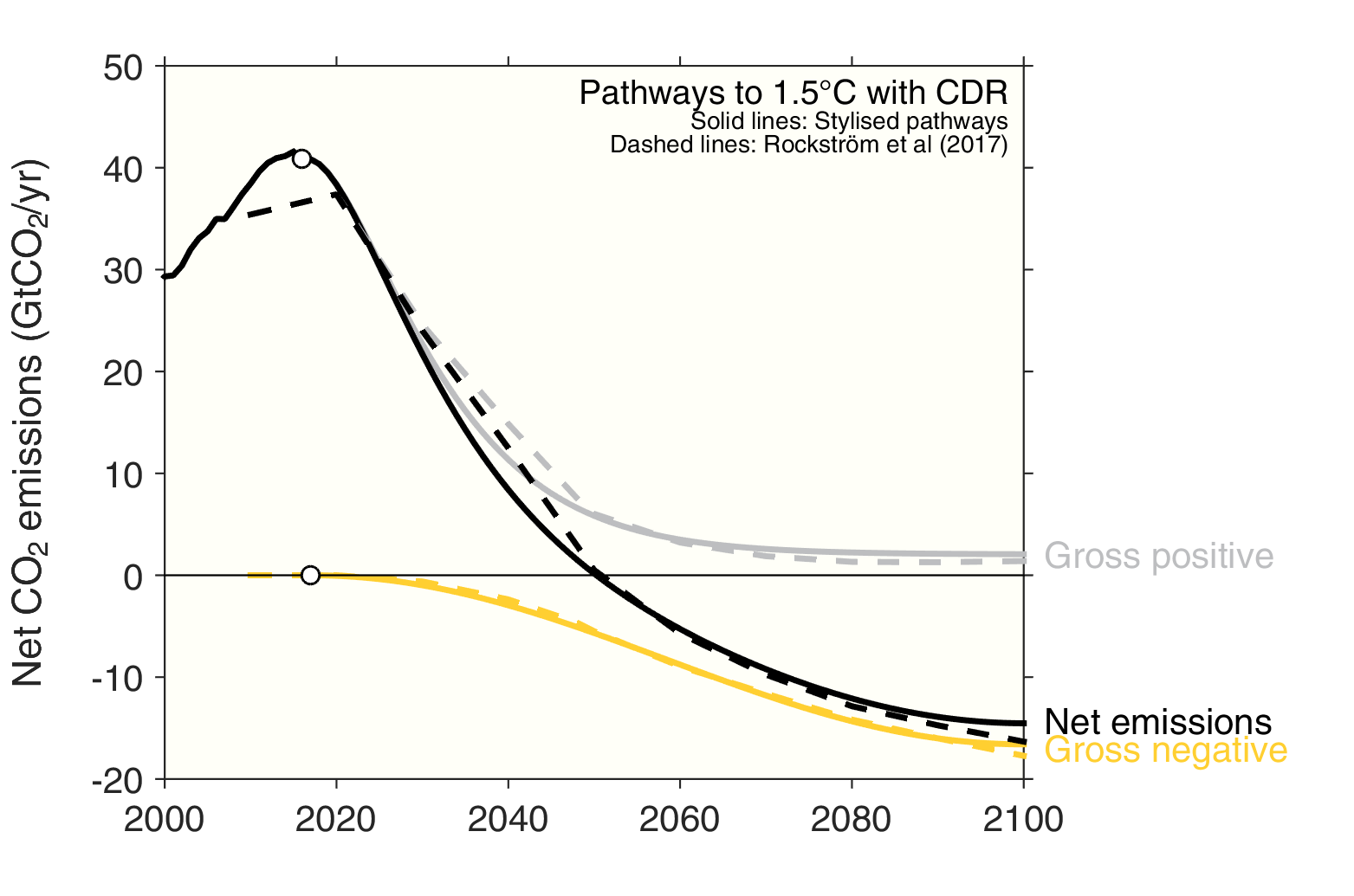
While the integrated assessment model results are based on an internally consistent modelling framework, the stylised functional forms used here allow rapid analysis and greater flexibility. Using the methodology developed here, it is straightforward to quickly explore the consequences of differences choices of negative emissions, while retaining the same carbon budget for a given temperature level.
